Conversation
sj
sj
Edited 11 months ago
DAMON results are arguably hard to understand. And no single visualization fits all. Hence DAMON user-space tool provides a feature[1] that lets users program their own visualization in Python code.
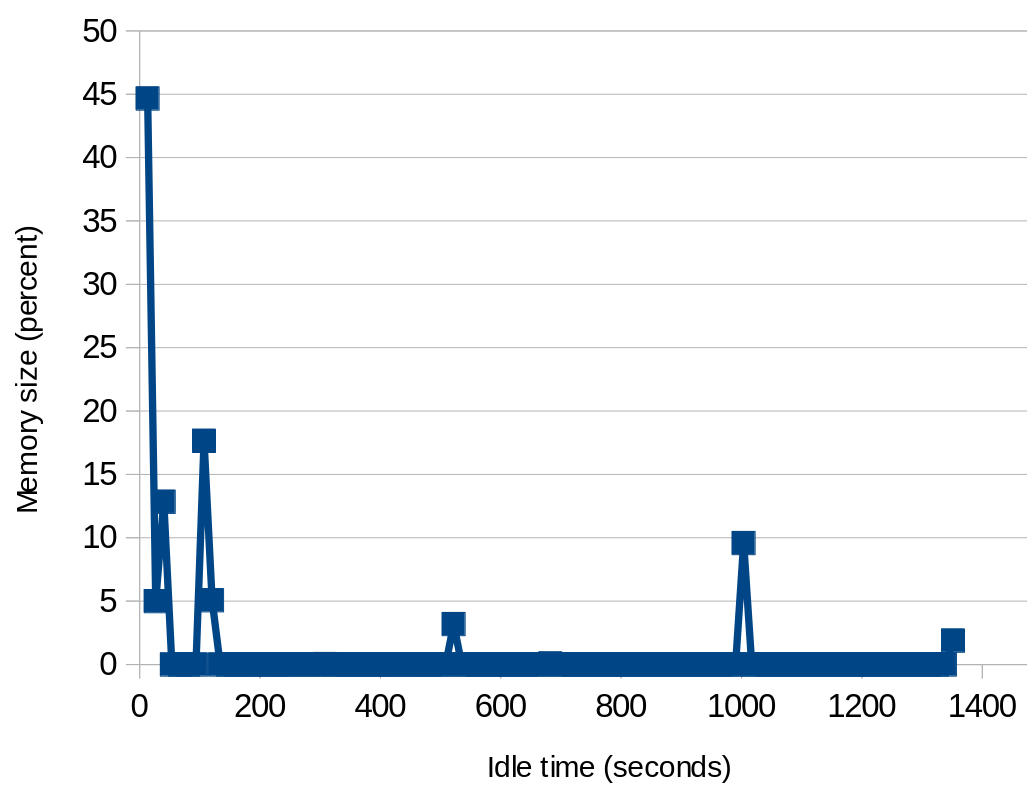
A visualization recently suggested was showing size of memory for different hotness, and sort the size values by the hotness. It can intuitively show cold memory tail. We implemented it as another custom visualization program[2].
The script outputs the visualization in text format, that can easily be plotted as a chart, like attaching.
[1] https://github.com/damonitor/damo/blob/next/USAGE.md#damo-report-access-programming-visualization
[2] https://github.com/damonitor/damo/blob/next/report_access_exec_scripts/idle_time_mem_sz.py
#linux #kernel #damon #damo
 0
0
 0
0
 0
0